Columns
Cartoons
Podcasts
Tipsheet
Videos
MY ACCOUNT
Account Settings
Newsletter Subscriptions
Log Out
Subscribe
LOGIN
Login
MY ACCOUNT
Account Settings
Newsletter Subscriptions
Comment Settings
Log Out
LOGIN
Subscribe
Tipsheet
Columns
Cartoons
Podcasts
Videos
Contact Us
Terms & Conditions
Privacy Policy
California - Do Not Sell My Personal Information
California CCPA Notice
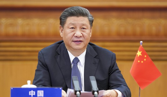
MSNBC Claims Russia, Saudi Arabia Is Plotting to Help Trump Get Elected
Sarah Arnold
State Department Employees Pushed for Israel to be Punished in Private Meetings
Sarah Arnold
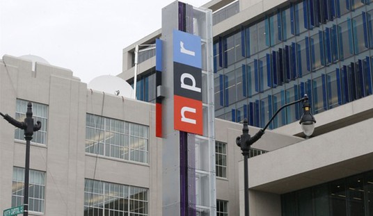
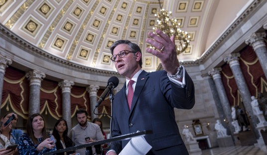
Speaker Johnson Under Fire, NPR Underwater, Trump Jury Under Investigation!
Townhall Video
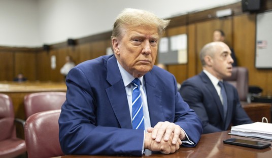
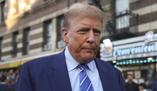
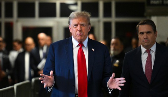
New Report Confirms Trump Won't Receive a Fair Trial
Sarah Arnold
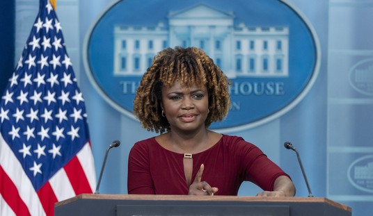
Karine Jean-Pierre References Charlottesville When Confronted About Pro-Hamas Chants
Rebecca Downs
Biden's Title IX Rewrite Is Here
Madeline Leesman
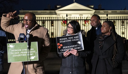
It's Been Almost a Week Since Iran Attacked Israel, Yet These Democrats Stayed Silent
Rebecca Downs
Advertisement
Columns
The Republicans Are Really a Mess
Kurt Schlichter
Democrats Give More Credence to Donald Trump's Talk of a 'Rigged Witch Hunt'
Spencer Brown
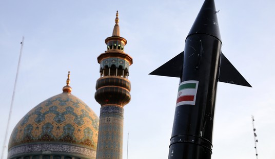
Are Iran's Nine Lives Nearing an End?
Victor Davis Hanson
Colbert Takes His Democratic Party Road Show to the Convention, and Jesse Watters Blamed for Reading WaPo
Brad Slager
Ich Bin Ein Uri Berliner
Matthew Foldi
Hold Obama-Biden Foreign Policy Responsible for Iran's Unprecedented Attack on Israel
Josh Hammer
Do Celebrities Have Deeper Liberal Thoughts?
Tim Graham
The World Is Paying a Deadly Price for Barack Obama's Foreign Policy Legacy
David Harsanyi
Maybe Larger Families Will Produce Better Leaders, as in the Early US
Michael Barone
The Mainstream Media: American Democracy’s Greatest Threat
Jeff Davidson
The Power of Forgiveness
Kathryn Lopez
All Columns
View Cartoon
This Just In
: Police Provide Update on Man Who Lit Himself on Fire Outside Trump Trial
Spencer Brown
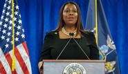
Does Biden Have Any Influence on the World Stage? Don't Ask Karine Jean-Pierre.
Spencer Brown
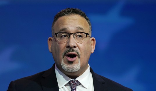
Biden’s Education Secretary Vowed to Shut Down the Largest Christian University in the U.S.
Madeline Leesman
Advertisement
Trending
1
Police Provide Update on Man Who Lit Himself on Fire Outside Trump Trial
Spencer Brown
2
New Report Confirms Trump Won't Receive a Fair Trial
Sarah Arnold
3
Biden’s Education Secretary Vowed to Shut Down the Largest Christian University in the U.S.
Madeline Leesman
4
MSNBC Claims Russia, Saudi Arabia Is Plotting to Help Trump Get Elected
Sarah Arnold
5
We've Found the Most Insane Transgender Criminal Case Yet
Mia Cathell
6
State Department Employees Pushed for Israel to be Punished in Private Meetings
Sarah Arnold
7
Speaker Johnson Under Fire, NPR Underwater, Trump Jury Under Investigation!
Townhall Video
8
Are Iran's Nine Lives Nearing an End?
Victor Davis Hanson
9
Rand Paul Rips Mayorkas to Shreds During Tense Questioning
Townhall Video
10
Google Doesn’t Want You to Read This
Spencer Brown
Advertisement
Members Only
Colbert Takes His Democratic Party Road Show to the Convention, and Jesse Watters Blamed for Reading WaPo
Brad Slager
Following England’s Lead, Another Country Will Stop Prescribing Puberty Blockers
Madeline Leesman
The Republicans Are Really a Mess
Kurt Schlichter
Democrats Give More Credence to Donald Trump's Talk of a 'Rigged Witch Hunt'
Spencer Brown
Poll Shows How 'Ticked-Off Voters' Are 'Both an Opportunity and a Challenge for Republicans'
Rebecca Downs
Who's Ahead? New Barrage of 2024 Polling Sheds Light on Presidential, Senate Races
Guy Benson
Advertisement
The Republicans Are Really a Mess
Kurt Schlichter
'Low-Grade Propaganda': Bill Introduced to Defund Liberal NPR
Spencer Brown
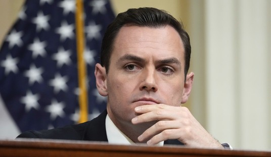
Another Republican Signs on to Oust Johnson
Rebecca Downs
Poll Shows How 'Ticked-Off Voters' Are 'Both an Opportunity and a Challenge for Republicans'
Rebecca Downs
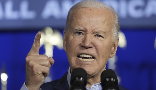
Did Biden Actually Have a Point With His Slip-Up on 'Freedom Over Democracy'?
Rebecca Downs
'See You in Court': Biden Policy Nuking Title IX Draws Legal Challenge From ADF
Spencer Brown
Trending on Townhall Media
UPDATED: Reports of Israel Carrying Out New Bombing in Iraq (Video)
STEALTH ATTACK: While Europeans Sleep, Americans Flood Twitter With Things They Can't Understand
Left Freaks After SCOTUS Rules 9-0 That Reverse Discrimination Is Good Cause for Lawsuit
RIGGED: Judge Merchan Let an Anti-Trumper Who Lied Onto the Jury
Tennessee Teacher Says Her Profession Can't Be Trusted With Guns
NY AG's Office Asks Judge Engoron to Void Trump's $175M Bond in Civil Fraud Case
She'll Fit Right In! New Planet Fitness CEO Loves DEI, 'Unconscious Bias' Training
Rand Paul Rips Mayorkas to Shreds During Tense Questioning
Townhall Video
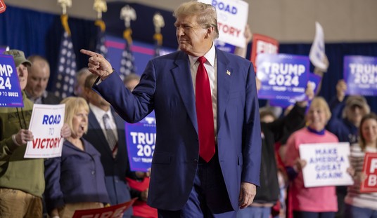
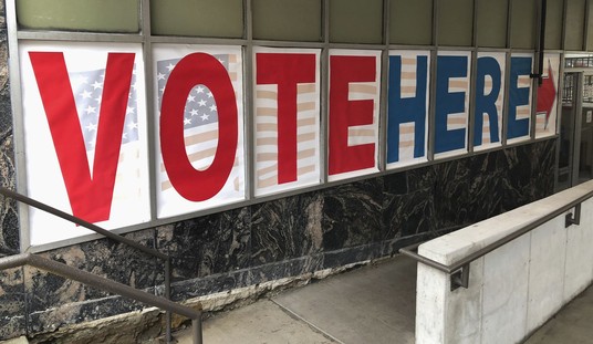
Trump Campaign, RNC Unveil Massive Election Integrity Program
Leah Barkoukis
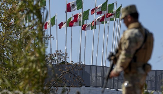
Here's Why a National Guardsman Shot an Illegal Alien
Madeline Leesman
Things Get Heated When Josh Hawley Calls Out Jennifer Granholm for Lying
Townhall Video
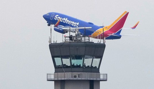
Another Day, Another Troubling Air Travel Story
Leah Barkoukis
Advertisement
Based on the Preliminary Info About the Trump Trial Jurors, the Rigged Narrative Will Resonate Quickly
Matt Vespa
Who's Ahead? New Barrage of 2024 Polling Sheds Light on Presidential, Senate Races
Guy Benson
Reporter to KJP: Can We See the 'Cannibal' Tab in Your Book?
Leah Barkoukis
We've Found the Most Insane Transgender Criminal Case Yet
Mia Cathell
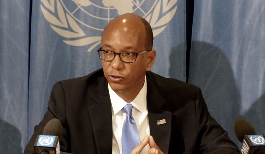
US Vetoes UN Resolution on Palestinian Membership
Leah Barkoukis
Advertisement
NPR Is a Total Dumpster Fire Right Now
Matt Vespa
Did This Factor Into Gallagher's Early Resignation Decision?
Leah Barkoukis
There Are School Walkouts Happening Over Furries. Please Shoot Me Into the Sun.
Matt Vespa
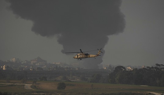
LATEST: Israel Strikes Back
Matt Vespa
Want to Take a Guess Why the Media Won't Cover What Just Happened in Maryland?
Matt Vespa
Advertisement
Watch Josh Hawley Expose DHS Secretary Mayorkas Over Release of Laken Riley's Accused Killer
Rebecca Downs
GOP Congressman Warns the Biden Admin to Protect Its Own Citizens, Not Illegal Immigrants
Sarah Arnold
MTG Introduces Strange Amendment As She Fights Ukraine Funding Package
Sarah Arnold
Watch This Purple-Haired Democrat Demand for More Ukraine Funding In Massive Rant
Sarah Arnold
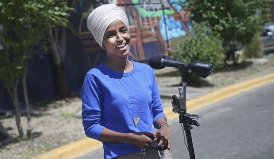
Ilhan Omar’s Daughter Arrested Amid Anti-Israel Protests
Sarah Arnold
Advertisement
12-Person Jury Has Been Selected In Trump Trial
Sarah Arnold
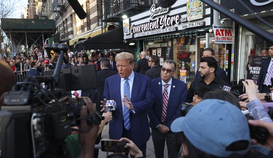
The Difference Between Trump's Bodega Visit and Biden's Gas Station 'Photo-Op' Is Truly Remarkable
Sarah Arnold
House Freedom Caucus Delivers Some Bad News for Speaker Johnson's Foreign Aid Bills
Rebecca Downs
More Polls Mean More Economic Concerns for Biden
Rebecca Downs
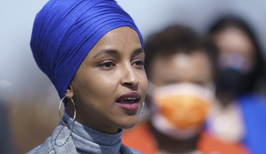
A ‘Squad’ Member’s Daughter Was Suspended From Her College for Participating in Anti-Israel Protests
Madeline Leesman
Advertisement
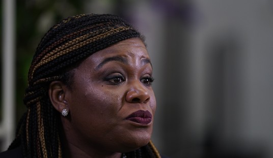
Cori Bush Paid Her Security Guard Husband $15K After DOJ Launched Probe of Such Payments
Spencer Brown
Smoking Gun Report: How the Chinese Communist Party Is 'Knee Deep' in America's Deadly Fentanyl Crisis
Guy Benson
House Passes Series of Iran-Related Legislation, With Some Telling 'No' Votes
Rebecca Downs
'Doesn't Add Up': Israel Aid Bill Includes $9 Billion for Gaza 'Assistance'
Spencer Brown
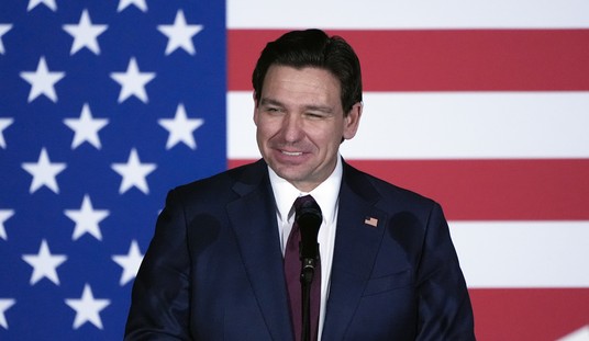
DeSantis Signed Off on a Revised 'Book Ban' Law. Here’s Why.
Madeline Leesman
Advertisement
You Can Probably Guess Which Dems Voted Against Condemning Iran for Attacking Israel
Spencer Brown
Here's How One Democrat Mayor Wants to 'Solve' Homelessness
Madeline Leesman
Jury Selection Process in Trump Trial Just Hit Another Snag;
UPDATE
: It Got Worse
Spencer Brown