Columns
Cartoons
Podcasts
Tipsheet
Videos
MY ACCOUNT
Account Settings
Newsletter Subscriptions
Log Out
Subscribe
LOGIN
Login
MY ACCOUNT
Account Settings
Newsletter Subscriptions
Comment Settings
Log Out
LOGIN
Subscribe
Tipsheet
Columns
Cartoons
Podcasts
Videos
Contact Us
Terms & Conditions
Privacy Policy
California - Do Not Sell My Personal Information
California CCPA Notice
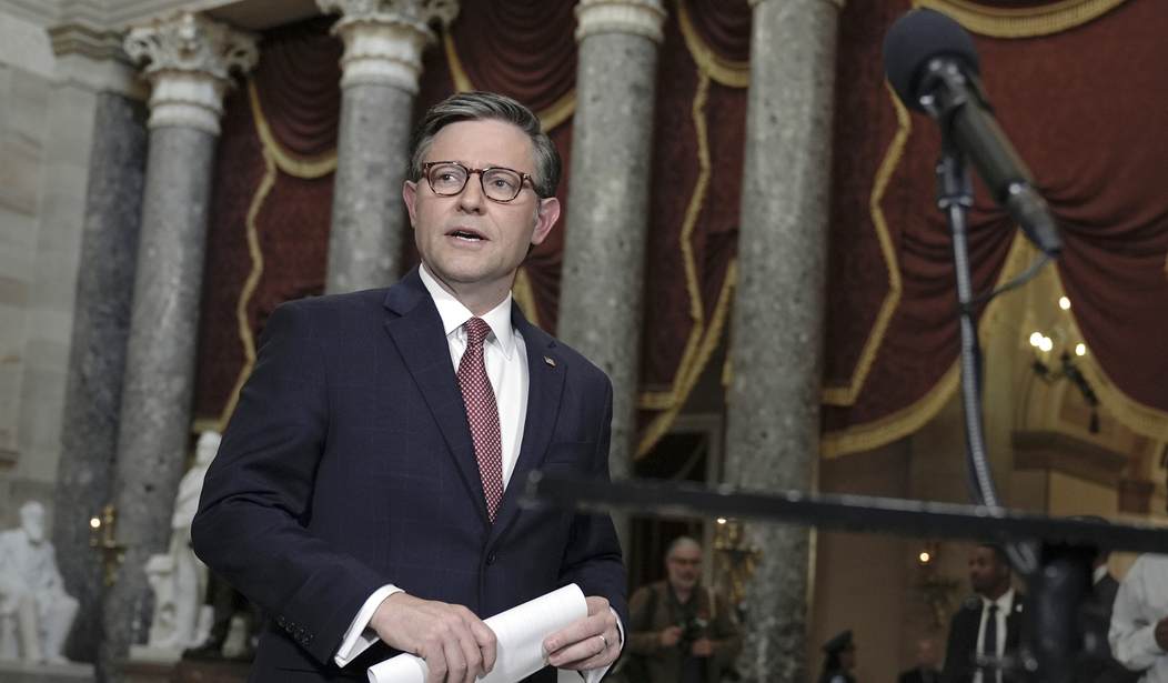
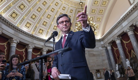
Mike Johnson Addresses Anti-Israel Hate As Hundreds Harass the School’s Jewish Community
Sarah Arnold
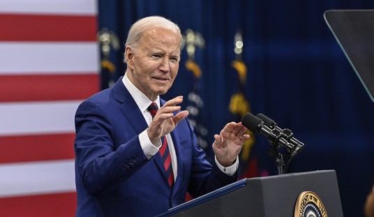
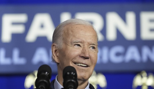
White House Insists Biden Has Been 'Very Clear' About His Position on Pro-Hamas Campus Chaos
Spencer Brown
DeSantis May Not Be Facing Biden in November, but Still Offers Perfect Response on His Abortion Message
Rebecca Downs
Former Democratic Rep. Who Lost to John Fetterman Sure Doesn't Like the Senator He Turned Out to Be
Rebecca Downs
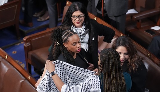
Pelosi's Daughter Criticizes J6 Judges Who are 'Out for Blood' After Handing Down Harsh Sentences
Sarah Arnold
Lawmakers in One State Pass Legislation to Allow Teachers to Carry Guns in Schools
Madeline Leesman
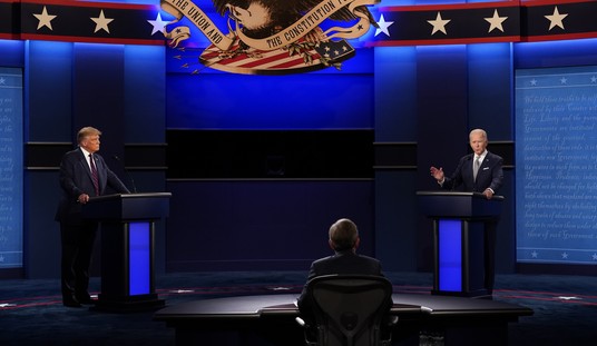
Watch Biden Lose the Battle With His Teleprompter Again
Spencer Brown
Advertisement
Columns
Is Hollywood Unwokening?
Kurt Schlichter
Capitalism Versus Racism
John Stossel
CNN Once Again Delivers Media Malpractice From Gaza
Brad Slager
Trump Not Sending His Best
Ann Coulter
Groupthink Chorus Emerges at Trump Trial
Byron York
Current Thoughts on the Campaign
Mark Lewis
Anti-Censorship Group Canceled by Pro-Hamas Authors
Tim Graham
Mike Johnson Is a Hero
Star Parker
City Where Emergency Response Time Is 36 Minutes Wants to Ban Civilians Carrying Guns for Protection
John R. Lott, Jr.
There's No Right to Sleep Outdoors
Betsy McCaughey
State Department: Ukraine Has 'Significant' Human Rights Issues
Terry Jeffrey
All Columns
View Cartoon
'This Is Where the Systematic Killing Took Place': 200 Days of War From Israeli's South
Katie Pavlich
Biden Rewrote Title IX to Protect 'Trans' People. Here's How Somes States Responded.
Madeline Leesman
Watch: Joe Biden's Latest Flub Is Laugh-Out-Loud Funny
Guy Benson
Advertisement
Trending
1
This Post on the 'Progressive' Pro-Hamas Mob Absolutely Nails It
Guy Benson
2
Watch Biden Lose the Battle With His Teleprompter Again
Spencer Brown
3
DeSantis May Not Be Facing Biden in November, but Still Offers Perfect Response on His Abortion Message
Rebecca Downs
4
'This Is Where the Systematic Killing Took Place': 200 Days of War From Israeli's South
Katie Pavlich
5
'Disturbing' Is an Understatement When Describing Would-Be Trans Shooter's Manifesto
Mia Cathell
6
Former Democratic Rep. Who Lost to John Fetterman Sure Doesn't Like the Senator He Turned Out to Be
Rebecca Downs
7
New Biden Emails Reveal Details About the Ukraine Whistleblower Who Got Trump Impeached
Matt Vespa
8
Lefty Journalist Deceptively Edits Clip of Fox News Legal Expert
Rebecca Downs
9
Trump Not Sending His Best
Ann Coulter
10
Dad Goes Off on Woke School Board Following Attack by Trans Student
Townhall Video
Advertisement
Members Only
Pelosi's Daughter Criticizes J6 Judges Who are 'Out for Blood' After Handing Down Harsh Sentences
Sarah Arnold
Lawmakers in One State Pass Legislation to Allow Teachers to Carry Guns in Schools
Madeline Leesman
Watch: Joe Biden's Latest Flub Is Laugh-Out-Loud Funny
Guy Benson
Is the Marist Poll a Cause for Concern?
Rebecca Downs
Is the FBI Monitoring These Pro-Terrorist Student Demonstrations?
Leah Barkoukis
Is Hollywood Unwokening?
Kurt Schlichter
Advertisement
Hundreds of Athletes Urge the NCAA to Allow Men to Compete Against Women
Madeline Leesman
Lefty Journalist Deceptively Edits Clip of Fox News Legal Expert
Rebecca Downs
Thanks, Biden! Here's How Iran Is Still Making Billions to Fund Terrorism
Spencer Brown
Hamas Publishes Proof of Life Video for American Hostage
Katie Pavlich
This Post on the 'Progressive' Pro-Hamas Mob Absolutely Nails It
Guy Benson
Barnard Caves to the Pro-Hamas Crowd
Leah Barkoukis
Trending on Townhall Media
WATCH: Texas DPS Shows Up at a Pro-Hamas 'Encampment,' and Beautiful Chaos Follows
NYU Protester Describes the Ordeal of Her Arrest, Assumes Cops Are White Supremacists
Biden Coverup of Afghan Airport Bombing
The Hell It Can't Happen Here!
Rittenhouse 'Victim' Keeps Leaving Out Important Part of Their Story
US Long Range Missiles Make Their Combat Debut in Ukraine and Puts All Russian Forces Under the Gun
FOX News: President Biden Forgives Violinist's $250,000 Student Loan
Dad Goes Off on Woke School Board Following Attack by Trans Student
Townhall Video
A Swiss Air Jet Nearly Collided With Four Planes at JFK Airport
Madeline Leesman
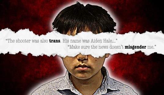
'Disturbing' Is an Understatement When Describing Would-Be Trans Shooter's Manifesto
Mia Cathell
Biden Drools Over AOC, Alec Baldwin Rages, Trump Lawyer Spits Fire!
Townhall Video
New Biden Emails Reveal Details About the Ukraine Whistleblower Who Got Trump Impeached
Matt Vespa
Advertisement
'Pathetic': DeSantis Blasts House Republicans for Giving Up Their Leverage on Top Voter Concern
Leah Barkoukis
Biden Can't Capitalize on His Supposed 'Superpower' for 2024
Matt Vespa
Is the FBI Monitoring These Pro-Terrorist Student Demonstrations?
Leah Barkoukis
Yale Student Stabbed at Pro-Hamas Demonstration Describes How the Campus Is a Terror Snake Pit
Matt Vespa
Columbia University's Pro-Hamas Activists Vow to Defend Camp Against Police Action;
UPDATE
: National Guard?
Matt Vespa
Advertisement
Senate Passes Foreign Aid Package, Sending It to President Biden to Sign
Rebecca Downs
LIVE RESULTS: Pennsylvania Primary
Spencer Brown
Squad Member Summer Lee Survives Primary Challenge
Rebecca Downs
Alec Baldwin's Encounter With a Pro-Palestinian Activist Is a Warning to All
Matt Vespa
There's Been an Update on Minnesota State Sen. Arrested for Burglary
Rebecca Downs
Advertisement
Did Kristi Noem Complicate Her Chances for VP With This Sunday Show Abortion Answer?
Rebecca Downs
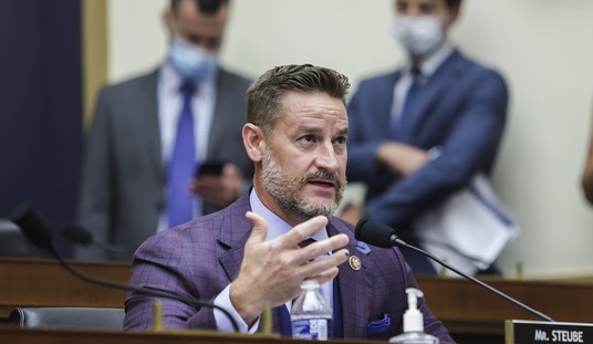
It's Been a Year Since the House Passed Rep. Greg Steube's Bill to Protect Women's Sports
Rebecca Downs
Biden's Crime Proclamation Sure Is Something
Rebecca Downs
Here's Who Trump Is Blaming for the Pro-Hamas Student Protests
Leah Barkoukis
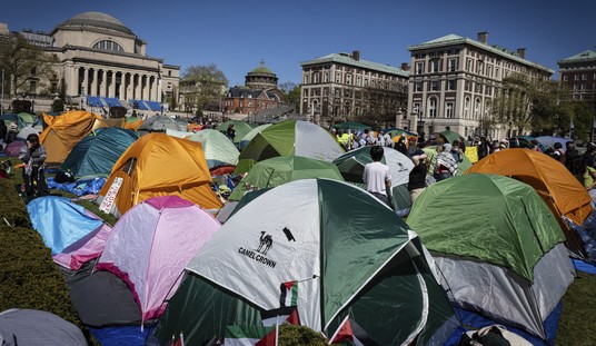
Following Anti-Israel Protests, Columbia Switches to Hybrid Classes for the Rest of the Semester
Madeline Leesman
Advertisement
Here's What Happened When a New York Homeowner Found Squatters on Her Property
Madeline Leesman
Senators Deliver Message to Biden on Schools Allowing 'Pro-Terrorist Mobs'
Spencer Brown
Here's How Sarah Huckabee Sanders Is Welcoming Education Secretary Miguel Cardona to Arkansas
Spencer Brown
Has Bill Maher Finally Seen the Light?
Townhall Video
Some of the Illegal Aliens DeSantis Sent to Martha’s Vineyard Will Be Permitted to Stay in the U.S.
Madeline Leesman
Advertisement
Judge Clashes With Trump Attorney at Gag Order Hearing
Spencer Brown
Media Stunned by Trump's Soaring Poll Numbers
Townhall Video
Biden’s ‘Ghost Gun’ Crackdowns Head to the Supreme Court
Madeline Leesman
Harvard Takes Action Against Pro-Hamas Student Group
Leah Barkoukis
NBC's New 2024 Poll Is Mostly Good News for Trump, But...
Guy Benson
Advertisement
Pro-Hamas Students at CA State Polytechnic University Went January 6 With Police
Matt Vespa
Former Rolling Stone Editor's Biting Attack on the NYT's 'Adults' Piece About Speaker Johnson
Matt Vespa
Trump Comes to Johnson's Defense
Leah Barkoukis